This blog teaches you how to convert spreadsheet data into graph in Microsoft Excel.
- Open your Microsoft Excel program.
- Click Blank Workbook on the top left side of the template window.
- Enter your date into the spreadsheet.
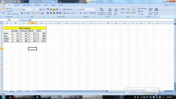
Enter the Name of the Company, months of sales, the sales amount and the items sold. On the left, you can see the items sold then followed by the corresponding sales amount per month.
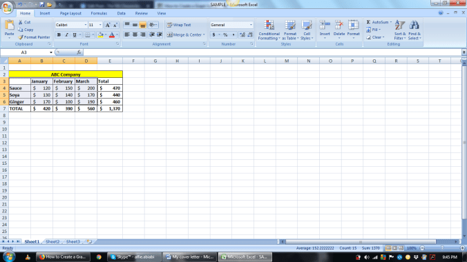
5. Click the area of data to be included for the graph presentation.
6. Then click Insert from the top most part and choose what kind of presentation or graph you want. Then click it.

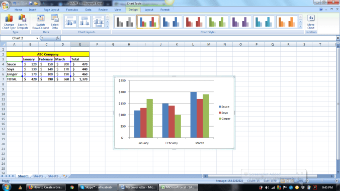
7. Drag the graph near your data.
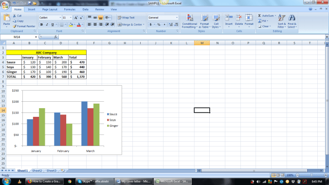
Now you have a simple graph presentation of your data as easy as 1, 2 and 3!
